Choosing the Perfect Colors for Your Knitted Project: A Color Theory Primer
Let's face it, choosing yarn is half the fun of any knitting project. But the right colors can truly make your creations turn heads! Just like selecting the perfect weight and gauge, color plays a starring role in the final product. Here's a dive into color theory to shed light on creating stunning color combinations for your knits, and yes, it'll be overflowing with images and color combinations that might just make your eyeballs do a happy dance. Don't worry, though, I’ll keep things clear and concise.
Please note that this blog post contains affiliate links. If you make a purchase after clicking one of these links, I earn some yarn money at no extra cost to you!
The Color Wheel
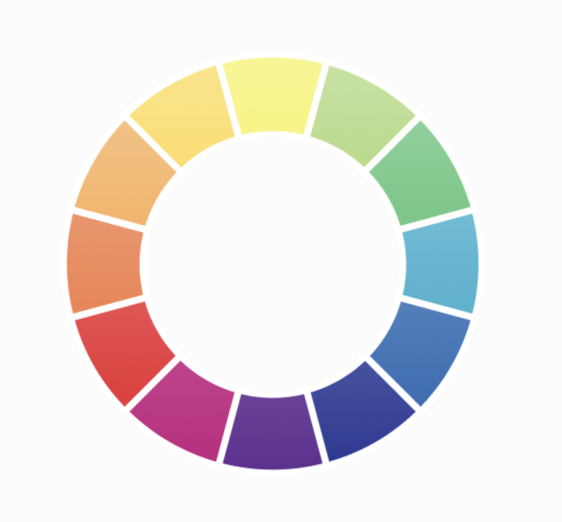
Think of the color wheel is a diagram that shows colors in a specific order based on their chromatic connection. Twelve hues make up the basic color wheel, which can be divided into three categories: primary, secondary, and tertiary grades. It organizes colors based on their hue (the actual color, like red or blue) and value (lightness or darkness). Here’s a cheat sheet to get you started.
Primary Colors: Red, yellow, and blue. All other colors are mixed from these three.
Secondary Colors: Orange, green, and violet. Created by mixing a primary and secondary color.
Tertiary Colors: Colors created by mixing a primary and a secondary color.
Complementary Colors: Opposites attract, right? Complementary colors sit directly across from each other on the wheel, creating high contrast and eye-catching combinations. Think of a Christmas sweater’s red and green or a sunset’s fiery orange and cool blue.
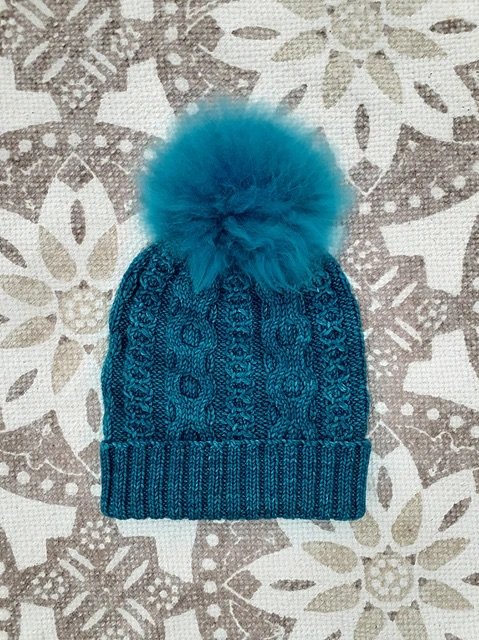
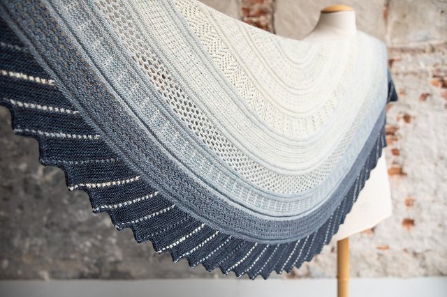
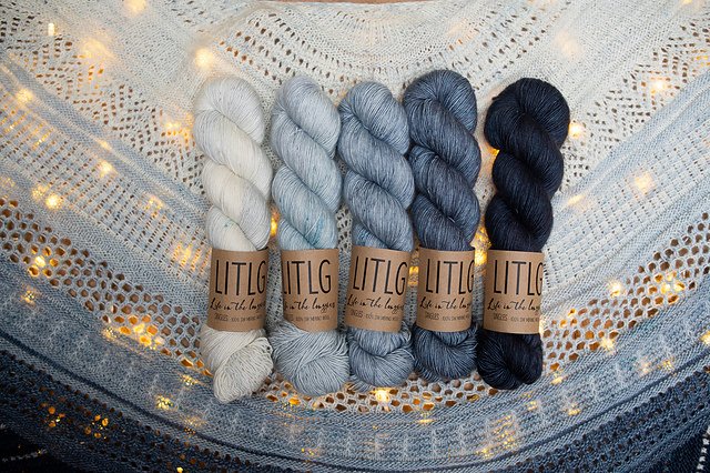
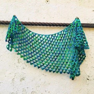
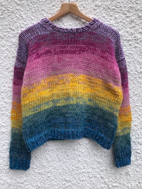
Analogous Colors: Colors that sit next to each other on the color wheel. Neighbors helping neighbors, sharing a common hue for a harmonious, monochromatic look. Think of a calming ocean gradient from turquoise to navy.
Color Theory in Action
Now that you’re familiar with the color wheel’s language, let’s explore some ways to apply color theory to your knitting projects.
Monochrome Magic
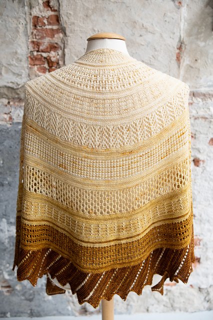
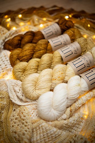
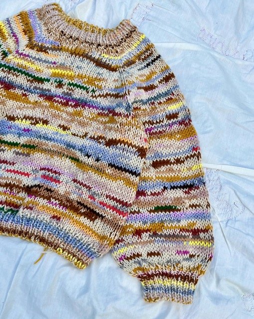
For a sophisticated timeless look, explore different shades of the same color. Think cream, beige, and brown for a cozy neutral palette, or soft pink and plums for a romantic spring vibe.
Analogous Appeal
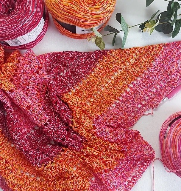
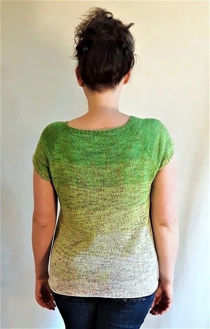
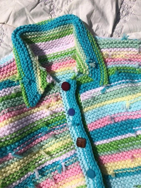
Tap into the harmonious nature of analogous colors. Channel the inherent harmony of analogous colors. This approach is perfect for beginners who want to create put-together projects without worrying about clashing colors.
Complementary Contrast
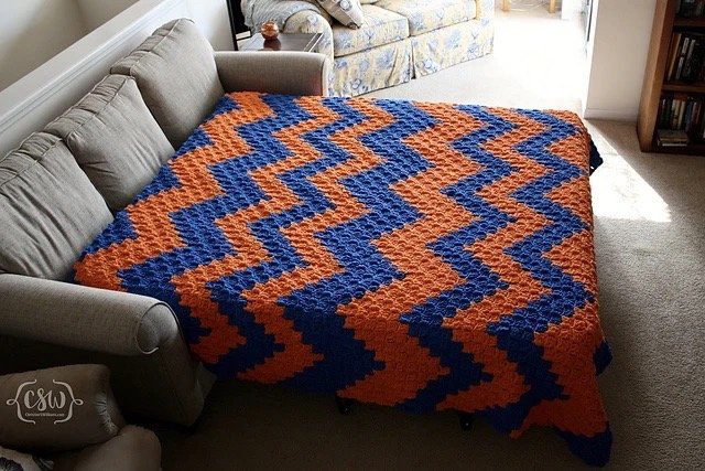
Feeling bold? Complementary colors can create a dynamic and eye-catching effect. Play with a bright yellow alongside a deep purple, or a vibrant turquoise with a fiery orange. However, a word to the wise: complementary colors can be overwhelming if used in equal proportions. Consider using one color as your main and the other as an accent for a balanced look.
Triadic Harmony
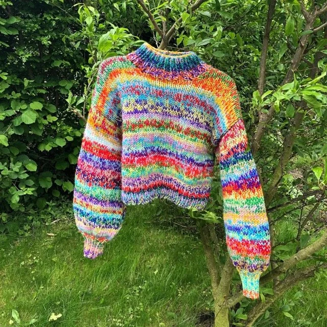
Spice things up with a triadic color scheme. This involves selecting three colors evenly spaced on the color wheel. (Think red, yellow, blue, or green, orange, and violet). While offering more variety than complementary colors, triadic palettes can still be quite bold. To create a more balanced look, consider using one color as the dominant hue and the other two as accents.
Beyond the Wheel: Inspiration is Everywhere
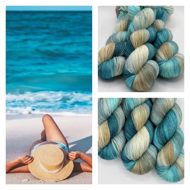
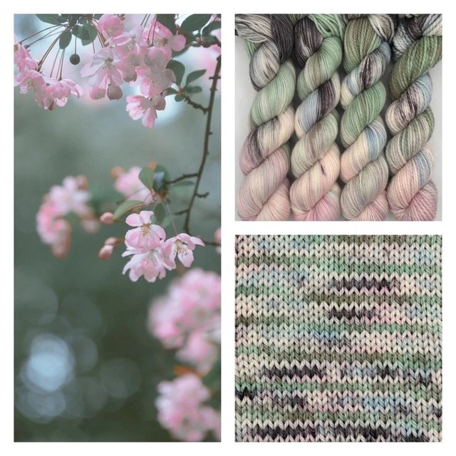
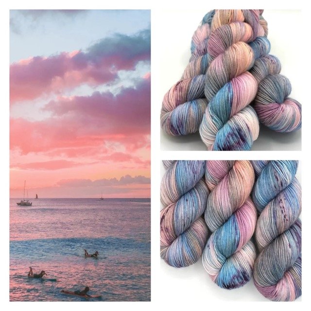
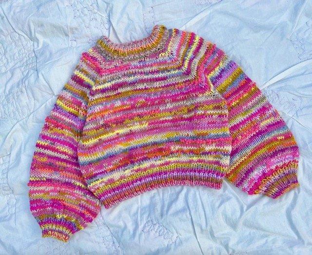
The world around us is overflowing with color inspiration! Take a cue from nature’s palette for a calming and organic feel. Perhaps a springtime meadow inspires you to use soft greens, yellows, and blues. If you love the idea of translating nature’s beauty into your knits, better check out Arcane Fiber Works!👇🏻They’re the expert in making vibrant and unique colorways inspired by nature (and get 10% off with code NEWWAVEKNITTING).
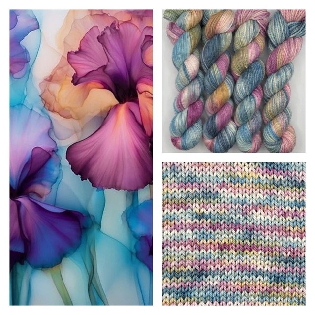
Look to art for inspiration as well. The color combinations used by your favorite painters can be a great jumping-off point for your next project.
Want to mix colors but feeling a bit unsure? Hey, we’ve all been there! That’s where The Knit Edit shines. Her patterns are like beautifully composed paintings, offering fantastic instruction on combining colors and textures for a look that’s both effortless and stylish. Whether you add one (or more) to your knitting projects or check out her separate guide on color-changing techniques, The Knit Edit can help transform that leftover yarn into a truly unique garment.
Don’t be Afraid to Experiment!
Color theory provides a roadmap, but remember, it’s not a rigid set of rules. Ultimately, the best color combinations are the ones that resonate with you. Don’t be afraid to experiment with different colors and palettes. Here are some tips to help you explore:
Make color swatches: This is a knitter's version of a color sketchpad. Knit small squares using different yarn colors you're considering. See how the colors interact with each other in real life.
Use online color palette generators: Many websites offer free color palette generators. Input a base color and let the generator create complementary or analogous palettes for you. This is a great way to spark new color ideas.
Draw inspiration from finished projects: Look at projects on Ravelry or other knitting websites. See what color combinations other knitters are using and use that as a springboard for your own creativity.
Now that you've explored color theory and unearthed inspiration, you have the tools to create stunning spring knits bursting with color confidence. Remember, knitting is an enjoyable outlet for self-expression. So, grab your favorite yarns, experiment with color combinations, and get stitching!
Now it’s your turn! Do you have any tips on choosing the perfect colors for projects? Do you feel inspired and what do you plan on making? Have any questions? Share your thoughts in the comments below!
